Image may be NSFW.
Clik here to view.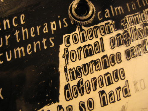
How did I not write anything at all about this project yet on this bloggy? I think it was because I was ***way way way behind schedule*** getting it done, so didn’t have any time to make process posts along the way. Then afterwards I got super wrapped up in organizing a bunch of stuff for a month of non-assimilationist Pride events here in Providence. So it goes!
Image may be NSFW.
Clik here to view.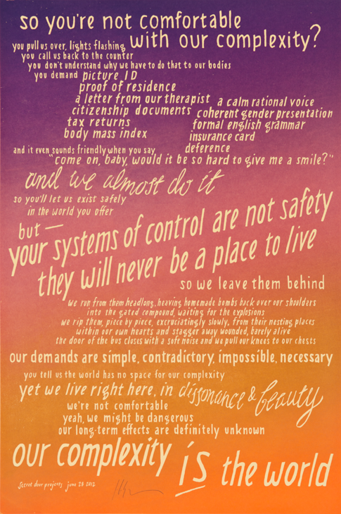
I made this print last summer, for a print portfolio project organized by the amazing political artist and potter Meredith Stern. The portfolio is called “This Is An Emergency!” and is focused on reproductive & gender justice. Meredith has been doing presentations about the project (and her work) around the country, as well as doing the logistics/promotion to get institutions and libraries to buy copies of the portfolio, which is super awesome cause a) those institutions have these radical prints, and b) it’s pretty great that some of my work is in the collection of institutions all over the place.
You can buy the purple-gold-orange colorway of this print here, and I also made two new colorways because I was running out of the first one; blue-silver-green (sparkly) and tan-gray-red (not sparkly). They are $20 — cheap! Shipping is $6 or I’ll deliver in Providence or you can pick it up. Get it, put it on your wall, use it to help tell your cis friends about what it means that you’re trans, to help explain to your parents why racial profiling is dehumanizing, or to help remind your students that their values are worth hanging on to even if they don’t coincide with the values of the academic institution… anyways, I made it for you.
Image may be NSFW.
Clik here to view. Image may be NSFW.
Clik here to view.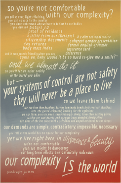
The full text is at the bottom of this post.
…
I spent a while brainstorming and writing the text for this print (and trying to figure out how to make the text more concise, but avoid “soundbites”/tumblr-esque-ness… also thinking about representation of human beings & once again deciding to avoid it)…
Image may be NSFW.
Clik here to view.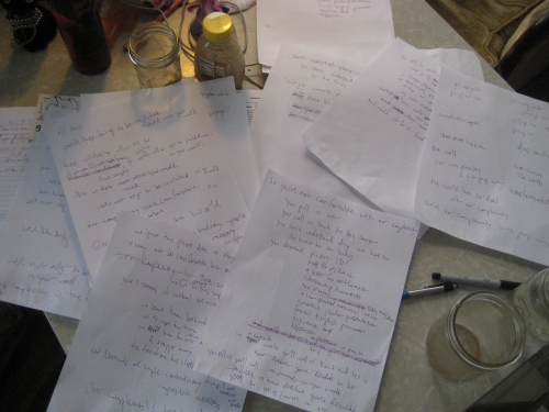
…and then time hit me & I realized that I needed to make the simplest possible print, alignment- and printing-time-wise… but how to make a “simple” print about “complexity”? Plus I wanted it to look super cool (the classic downfall, I know). I decided to make basically the whole “background” of the print a giant rainbow roll of *ink*, and leave the letters the color of the paper.
First step: draw out the text how I wanted it to read (thinking about “reading” vs “seeing” & how they work together), not getting it perfect but just enough to ink over:
Image may be NSFW.
Clik here to view.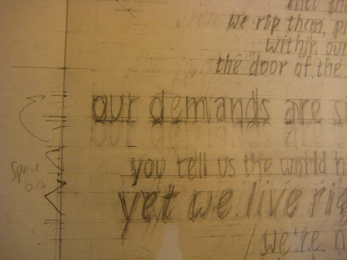
Then: inking. This was done on wet media mylar (“prepared mylar”), using a nib pen, brushes to fill in the background, and an Olfa razorknife to scratch unwanted ink away. Each of these steps requires some time for ink to dry, and is contingent on working your way across the surface in one direction at a time, so you don’t smear the wet ink you’ve just put down. I also wear thin cotton gloves, with the thumb & first two fingers cut off the dominant hand, to protect the plastic from the grease on my hands. Okay here goes! Watch the lower-case “g”s…
1. outline the letters & begin to fill in their smallest concavities, with the pen:
Image may be NSFW.
Clik here to view.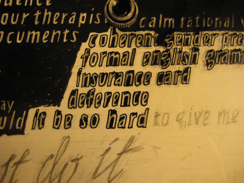
2. fill in the spaces between the letters with a small brush:
Image may be NSFW.
Clik here to view.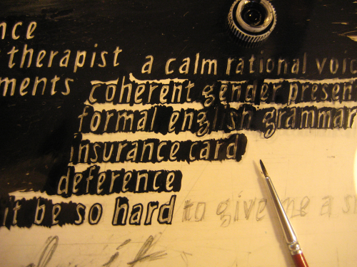
3. fill in the ink on one side of the letters with the brush:
Image may be NSFW.
Clik here to view.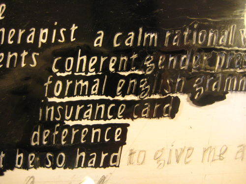
4. …and then fill in the final gap:
Image may be NSFW.
Clik here to view.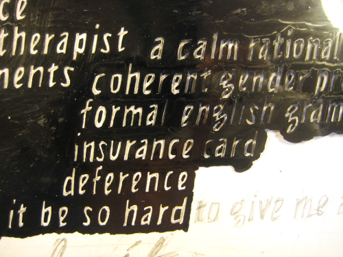
5: now with the back of the point of the Olfa knife, fix any places where you blobbed over the line, clean up the inside part of the “e”, “a”, “o”, etc, square off the corners and ends of the letters (check out those “g”s), and generally sharpen it all up:
Image may be NSFW.
Clik here to view.
Was this simple? Kind of. Did it take a hell of a long time? YES. I’m terrible at this time thing.
But that aside… I really like working this way because it produces letters that are native to the materials I’m using to create them. The act of my hands using specific tools to make them is what gives the letters their shape — not just aesthetic decisions in a vacuum. It was intriguing to make a couple different sizes of the same letters, and a vertical and slanted set (not sure if “roman” and “italic” apply here), and to see how they all came out differently… Of course, there’s an alternate set of letterforms created by “drawing the same letters” but with ink as the *positive* instead of the negative — just as cutting “the same” letters negatively or positively out of rubylith results in different forms. Someday! actual usable computer fonts will come out of all this work… maybe?
Here’s a cool photo Pam Murray took to show the metallic ink I used to print it, and the resolution of the letters:
Image may be NSFW.
Clik here to view.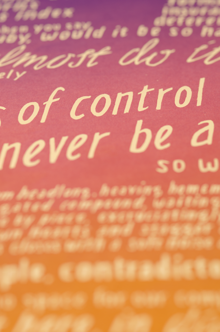
And I wanted to include one quick set of images to answer the question “But how did you do the rainbow roll at an angle?”
A. Shoot the transparency on the screen at an angle!
1. transparency at an angle, and a “linear blob” of different colors of ink on the screen:
Image may be NSFW.
Clik here to view.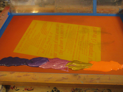
2. a couple of prints into the run, the rainbow roll has smoothed out (you can see how the paper is aligned on the table at an angle as well):
Image may be NSFW.
Clik here to view.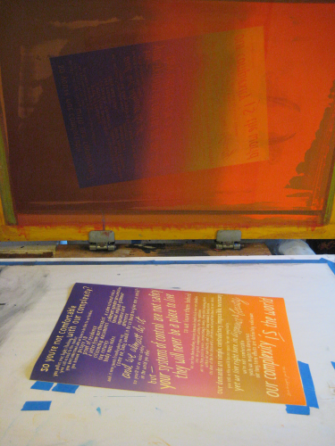
3. epic squeegee (don’t drop it):
Image may be NSFW.
Clik here to view.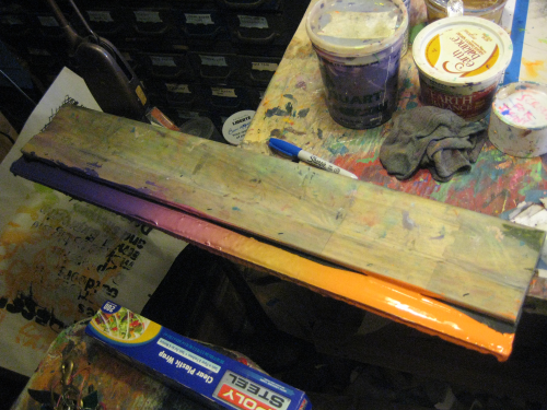
One last note about this portfolio format for political art work generation and distribution — it rules!
Meredith is part of Just Seeds, a radical artists’ collective, and though this portfolio was not a formal Just Seeds project, they’ve used the same model a number of times: “a group of artists each make a print about an issue, possibly collaborating with organizations or mentors, then those prints are collected into a portfolio which is both distributed to organizations to sell/use/display, and can be shown as a thematic exhibit and be the occasion for discussions and an impetus for activism”. It’s a pretty bad-ass method for disseminating political art outside of the big-money art market, for getting little-known artists (like myself) some wider distribution and possibly recognition, and for providing art to political organizations.
It seems like something that should happen as widely as possible. If you know of an issue in your town or area that could use a bunch of prints made about it, grab this idea & run with it! Contact Meredith through her website to ask her questions about the process… She has worked really hard to make the whole project happen, and to promote it & make it successful, but it now has a momentum of its own: a young woman came up to where I was tabling at the art sale last weekend with Sam Merritt, who also made a print for the portfolio and was displaying it in front of our table, and asked her “Is that print in that, uh, reproductive rights collection? That was exhibited at my college last month — people were lining up to see it, it was a great event, everybody loved it!”
Image may be NSFW.
Clik here to view.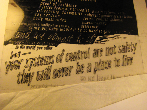
Full text of the poster:
so you’re not comfortable with our complexity?
you pull us over, lights flashing
you call us back to the counter
you don’t understand why we have to do that to our bodies
you demand picture ID, proof of residence, a letter from our therapist, citizenship documents, tax returns, body mass index, a calm rational voice, coherent gender presentation, formal english grammar, insurance card, deference
and it even sounds friendly when you say, “come on, baby, would it be so hard to give me a smile?”
and we almost do it
so you’ll let us exist safely in the world you offer
but — your systems of control are not safety
they will never be a place to live
so we leave them behind
we run from them headlong, heaving homemade bombs back over our shoulders into the gated compound, waiting for the explosions
we rip them, piece by piece, excruciatingly slowly, from their nesting places within our own hearts and stagger away wounded, barely alive
the door of the bus closes with a soft noise and we pull our knees to our chests
our demands are simple, contradictory, impossible, necessary
you tell us the world has no space for our complexity
yet we live right here, in dissonance & beauty
we’re not comfortable
yeah, we might be dangerous
our long-term effects are definitely unknown
our complexity is the world
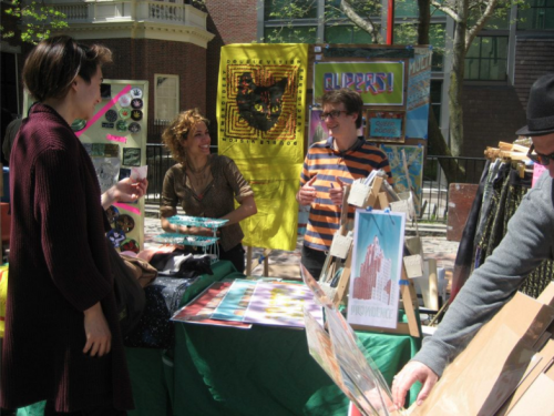
In re. the art sale: here I am, sleep deprived & coffee fueled, in a shirt that is my favorite colors, in need of a haircut, gesticulating about something I don’t remember but which seems entertaining, standing outside with Sam and a girl I don’t know, under a nice sign that says “QUEERS!” — that’s good, right?
