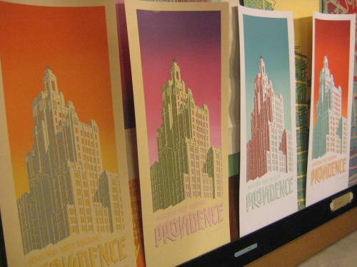
In the past I have been very frustrated, impatient, and (even?) bored when re-printing new editions of old prints. When you print something for the first time, there’s the moment of excitement when you see how the color layers are coming together, all these interactions that you had previously only conceived of in your head and tried your best to build into the transparencies. That moment can be super exciting, when it all works as you planned… super frustrating, when you realize how far off you were… either way, undeniably compelling.
That flash of totally new resolution, and the engagement & process & figuring out that go along with it, is missing from a second printing, and I’ve found myself just not caring about how a second edition of a print turns out. I don’t know if that’s a terrible confession of my artistic callousness — or if it’s actually okay, like it’s just not life-or-death anymore, and really it’s not life-or-death at all in the first place, it’s just ink on paper, it’s okay, and the second-edition-reprints make that clear (whereas the first printing of something is usually the culmination of a ton of work and stress and intense energy and carries all that momentum…).
But for some reason re-printing the Industrial Trust Building prints (first printed in 2009) was really fun and I had a great time mixing the colors and I think they are a lot better (or maybe just more confident and less conservative) than the original colorways… and I have developed a lot of control over the rainbow roll / ink gradient (most of which just involves doing lots of test prints on waste sheets when you can tell the gradient will not be smooth)… and I have somewhat better command of the transparent colors as well. Also I have this new technique for keeping my screen exactly in the same place which takes all the frustration out of alignment (!!!).
So! Very satisfying. There’s one “subtle” colorway, partly inspired by the personal fashion color scheme of awesome friend Christiane Marie, one “pink and grimy green” colorway for all those pink-lovers which now includes me I guess, and two more that are semi-converses of each other and are somewhat based on colorways from the postcards and are just bold & good. When sleep-deprived I have found myself saying that the colors on the blue-&-mint-green-sky print are “perfect”. Not sure I would totally stand by that when not hopped up on two hours of sleep. But it looks pretty nice.
Color mixing sequence. The first picture here appeared in the last post, but I threw it in for nerdy comparison purposes. Look at the two test sheets, one white, one ‘ivory’, that appear in all three of these photos, for context of “how many marks have been made since the last photo was taken”…
I took this picture for Buck Hastings so we can prepare to battle, I think he will win…
Chipboard is so not archival but it looks sooo good with silkscreen ink on it…
Your diligent correspondent, having just printed around 350 of these bad boys; that’s 2 pulls on each print, not counting all the test pulls on newsprint! I’m awaiting the day when someone says to me, “Wow, you really have the shoulders of a serigraphist!”
Here are some of the shelves I referenced in the last post: the new ones are on the right, at paperback-depth (upper) and zine-depth (lower)…
… and new ink shelves for all the transparent colors (the laser-cut background panel was scrap from a recent project by amazing Providence artist & friend Joan Wyand!).
…unrelated…
Looking across the Woonasquatucket River valley, from the (newly cleaned up & organized) third floor studio:
and last but not least, happy Halloween from Buio!


